K
Return Home

Reimagining the Two-Wheeler Commute Experience

A UX case study focused on solving everyday problems for riders through intuitive digital cluster design.

Smart Commute Home Screen

The Challenge

Two-wheeler commuters face several friction points in their daily rides. My goal was to identify and solve these usability issues to create a safer and more seamless experience.

Steep Slopes

Riders struggle to get out of the house due to steep slopes, especially without a hill-hold feature.

Lack of Feedback

Basic functions (especially on LCDs) provide poor feedback, leaving riders unsure if a command was registered.

Complex Navigation

Simple tasks often require too many steps to complete, distracting the rider.

Forgotten Belongings

Users confusingly miss basic belongings on their way to work.

Research & Discovery

Primary & Field Research

I conducted one-on-one interviews with users to gather qualitative data. The follow-up questions revealed deep frustrations with existing cluster interfaces.

  • Trip Reset Uncertainty: Users found trip resetting too complex. They would press and hold buttons without knowing if it worked, leading to frustration.
  • Navigation Fatigue: Basic functions required navigating through multiple screens, which created frustration while riding.

Following these interviews, we conducted Field Research to benchmark existing solutions:

  • We discovered that while many standard LCD clusters lack feedback, modern Digital TFT clusters provide clear visual confirmation during actions like trip resets. This gap in feedback became a key focus for our design.

The Solution

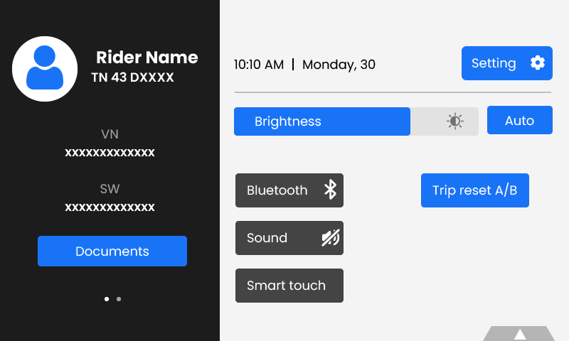
Smart Touch & Quick Settings

To address navigation fatigue, I introduced "Quick Settings" and a new feature called "Smart Touch".

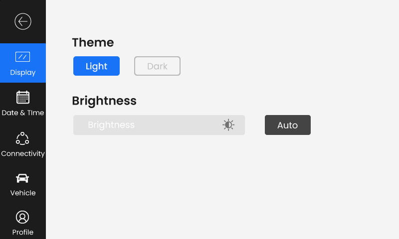
Quick Settings: Access standard features like Brightness, Theme, and Bluetooth toggle instantly.

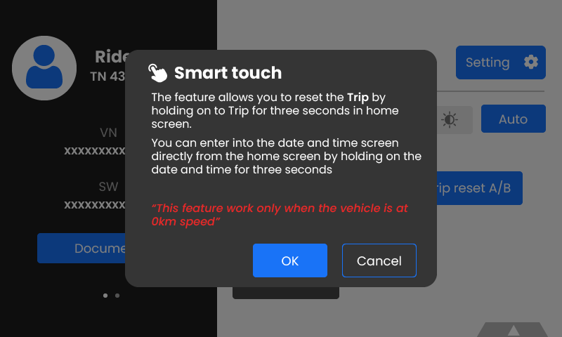
Smart Touch: Enables completing tasks directly on the Home Screen. For example, holding the 'Trip' button for 3 seconds resets it, with a visual loading indicator to provide the missing feedback.

Quick Settings Screen
Quick Settings Panel
Smart Touch Interface
Smart Touch Interaction

Testing & Iteration

Initial User Feedback

During testing, users struggled to navigate because they weren't aware of the "Smart Touch" capabilities. The hidden nature of the gestures was a barrier.

The Fix

Once users were taught the feature, they loved it. The time to complete tasks dropped significantly.

To bridge the knowledge gap, we added an onboarding popup screen that educates the user about Smart Touch features when activated, ensuring discoverability without compromising the clean UI.